 This was one of my first endeavors into graphic design, although it was actually an assignment that contributed towards my degree in Animation and Illustration.
Assignment Brief
Im afraid I'll have to paraphrase the brief because it was just so long ago, but as I recall it was to come up with a full page (portrait) black and white newspaper ad using the well known 'Should've gone to Specsavers' slogan. It was our job to come up with an appropriate interpretation of the slogan - a sort of visual malapropism - and illustrate it using either Adobe Photoshop or Illustrator.
There was also a sister-brief to create a large format billboard in full colour, landscape with a different interpretation of the Specsavers slogan. At this point I was exploring different artistic styles and decided to try to digitally paint myself as a child mistaking a large lady who was bent over at the beach for a donkey (true story). It was one of my first attempts at digitally painting and the complex layout coupled with the multitude of textures meant that I struggled. It was a disaster - but the Oopsie Audrey! piece you can see here really rescued my grade.
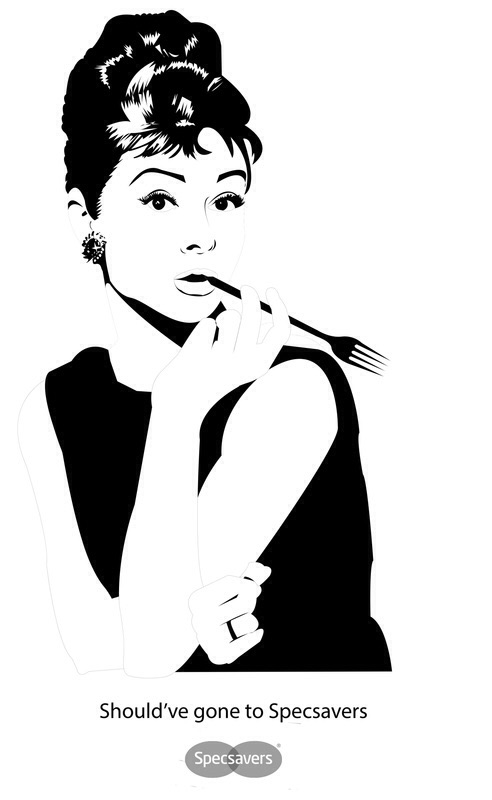
Oopsie Audrey! - Graphic Design or Illustration?
At this point I had already blundered through the billboard assignment and it had actually got me a little down. For this one I decided to throw the rulebook out of the window and make a really good advert, and I would have to take the grade on the chin.
The concept of Oopsie Audrey! clearly evolved from the brief's format. Many of my classmates were fighting with the constraints of the black and white piece, but I went the other way and came up with a concept that couldn't possibly work in colour. The iconic image of Audrey Hepburn was perfect for the brief at hand, and I had the idea for her to mistake her signature cigarette holder for a fork as my interpretation of the Specsavers slogan.
I recreated the portrait and included the fork using Adobe Illustrator and I was really pleased with the end result, which was such a relief after the great billboard fiasco.