This project is owned by Drive By Websites & Drive By Design or the respective client, and is posted with permission.
Click Here to see more of my work for Ashwood Homes
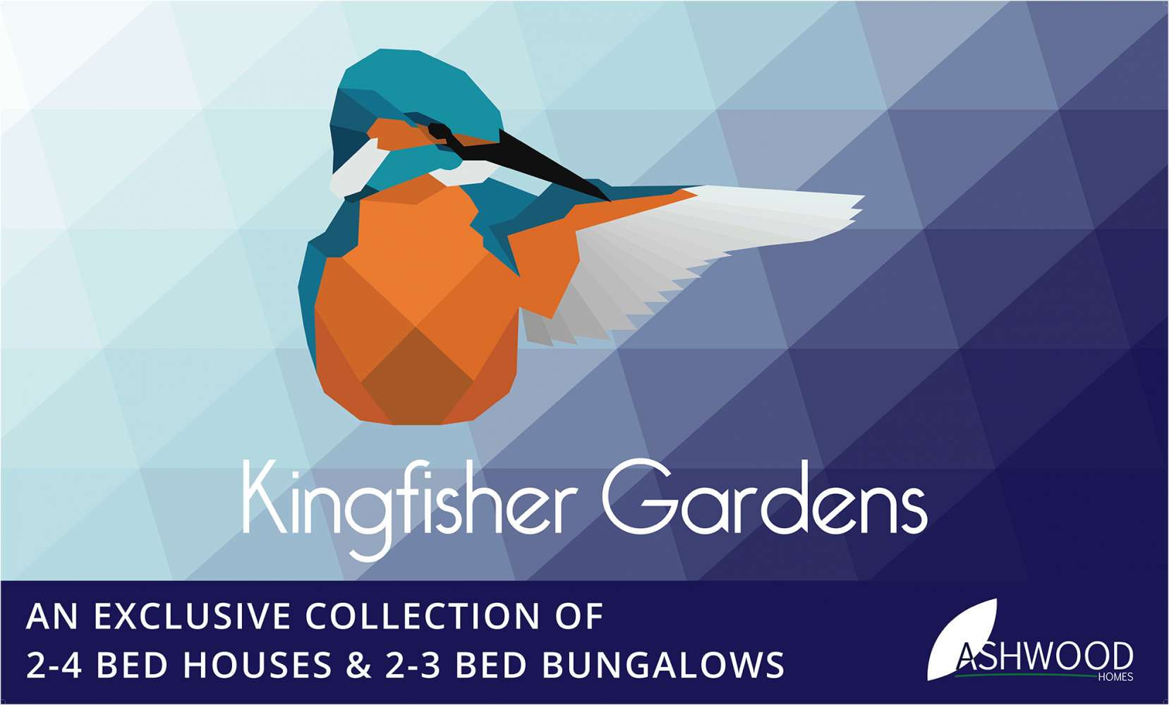
Kingfisher Gardens is one of my first and favorite branding projects I’ve undertaken to date.
Regular clients of Drive By Websites & Drive By Design, Ashwood Homes always bring us briefs that are fun and give us a lot of creative freedom. As a thriving property development company, they build up several development sites a year in locations in and around Lincolnshire, and each development is fully branded. That presents a unique opportunity; a miniature brand which will only exist until all of the properties on site are sold - about a year. This eliminates the need for an evergreen brand identity, allowing instead for branding that is completely on-trend and in the moment.
As a rule, I like to look at other forms of art and design that have a similar half-life, so when Ashwood Homes presented us with an unnamed development site located in the village where I spent my childhood, a little bit of research threw up the perfect style;
low-poly. I came across the style whilst looking at tattoo trends on Pinterest – tattoos might last a lifetime, but the trends only last a year or so, and most are designed with taste in mind. The clean, shape-based style really lends itself to logo design and the blend of a traditional British bird with the modernity of a low-poly style reflects Ashwood’s identity as a company that builds modern properties, but holds traditional values at heart. The Ashwood team loved the idea (along with the suggestion of a kingfisher) and accepted my first logo design right away.
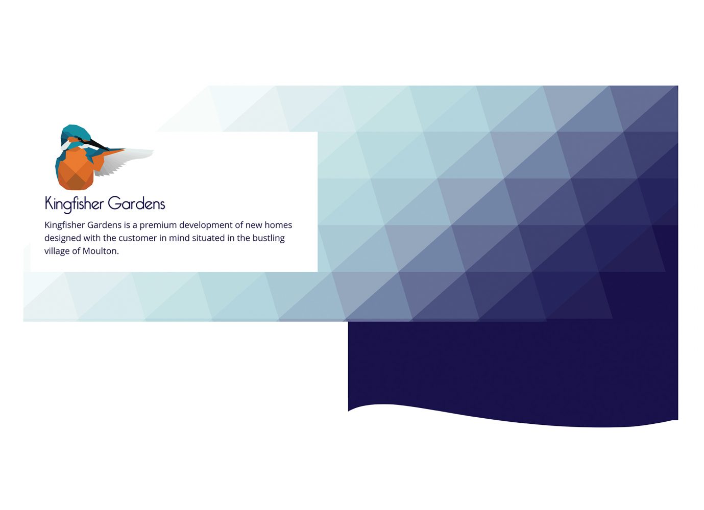
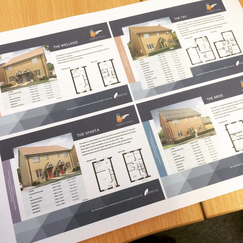
After moving onto the brochure design, the surrounding branding presented another question mark, but after some deliberation, I settled on a low-poly gradient - another trend that was and still is on the rise – fading from white to Ashwood Homes’ iconic blue.
From that point onward, the design focus shifts from implementing visually striking, inviting and memorable imagery, to sleek
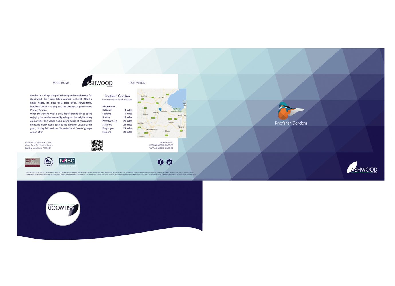
functionality. The brochure itself takes the form of a presentation folder; this comprises of a cover that focuses on the branding, location and the methods of contact, and an insert (unbound page which slots into the cover) per housetype.
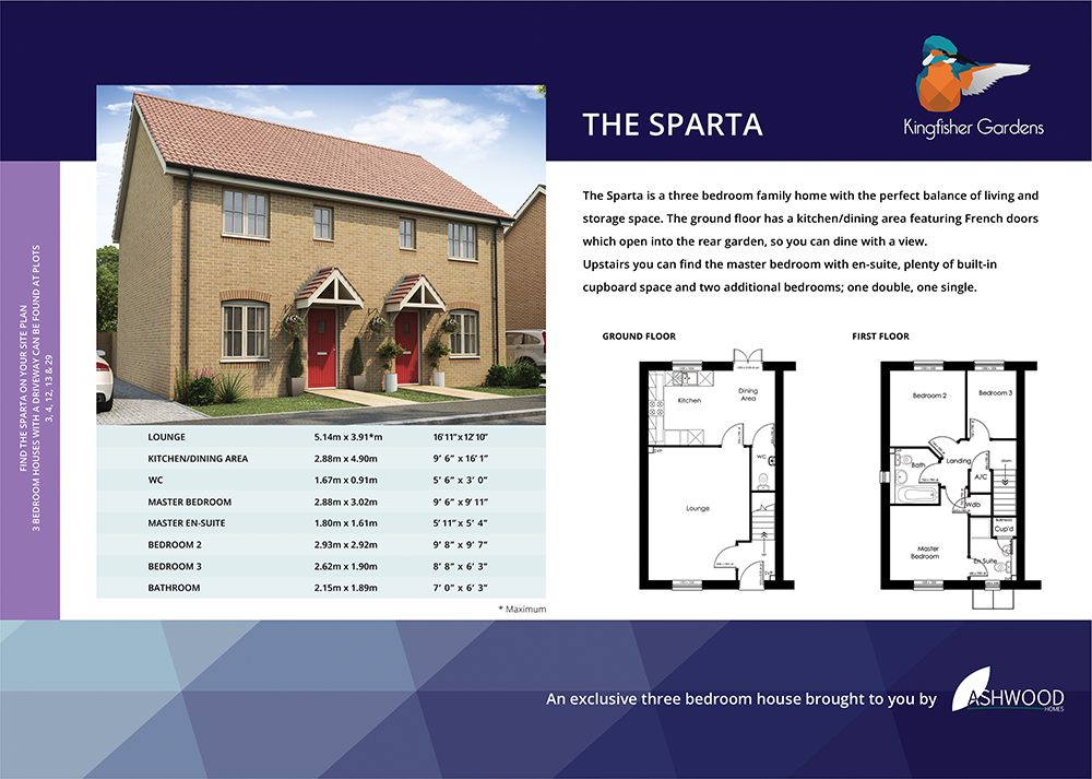
The housetype inserts communicate the lion’s share of the information like layout, room dimensions and plot numbers, etc. So a utilitarian approach to the design, including features like floorplans and tables is really important for ease of communication, but can present a design challenge. In this case I created a nifty design feature in the form of a coloured bar along the left edge of the insert – the colours match the housetype key for Ashwood’s site map and the text includes the housetype, number of bedrooms, external features such as a garage and the relevant plot numbers – all the key information you might need in a convenient location for leafing through the pages.