
Welcome to Doghouse Media; my portfolio site which is a portfolio piece in itself. Because I work for a company which predominantly deals with web design and development, I thought it might be time to ditch my crumby Weebly website and put together a real, self-hosted portfolio site.
Doghouse Media brand concept
The brand concept was born out of a few things, the first being the purpose of the site. When working with clients, we offer multiple options at every stage of the design process, which means there are lots of designs which never see the light of day due to a client's needs and personal preferences; the number of wasted designs goes up even further with people who are unsure of whet they want from us. Doghouse Media is a space for me to put the rejected designs so they're not totally wasted.
I'm the only designer at Drive By Websites & Drive by Design, so this site doubles up as my portfolio, including the designs I do at work and my animation and illustration portfolio (areas we'd like to incorporate into Drive By anyway). If I get any good at web developing (as opposed to just designing), there might even be a couple more web development projects thrown in.
Themes of colour & contrast
Sharp contrasts run throughout Doghouse Media's branding; the point of the site being to showcase nice-but-rejected work, the juxtaposition of 'Doghouse' implying something rundown and shoddy with the clean and sleek design interlinks with the content. The logo and web design are underpinned by the striking Cornflower Blue to Froly Pink gradient and provides an array of colours in between which are really handy when trying to keep things on-brand, but not tired or repetitive.
I created a series of brand elements including several logo variations, a preloader motion graphic, not to mention the web design which is tailor made and streamlined so that it's 100% fit for purpose.
I'm brand new to CSS and it's the first time I've delved into the web development side (as opposed to just the aesthetic aspects of web design), and I'm always looking to learn, improve and of course optimise my site, so who knows what the current web design will be at the time of your reading.
Update
You may have noticed some recent updates to the overall look of this site, the homepage in particular doesn't look anything like the screenshot any more. My original plan was to use the masonry layout as a way to jigsaw my portfolio pieces together in a graphic way. Because of the way masonry layouts work, broadly speaking I didn't have to worry about the size or orientation of my featured images, which is good because of the variety in the work I do.
As time went on, I realised my homepage had descended into a bit of a mess. Some images were very thin and long, and were therefore made very big, while other, more landscape images appeared to be very small and the images with a white background appeared to be floating and those with a background were boxed in. Another problem was that although my designs, animations and illustrations were visible, without a title it was often unclear what the project or work done was.
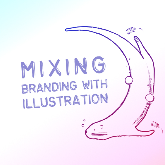
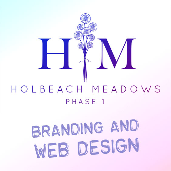
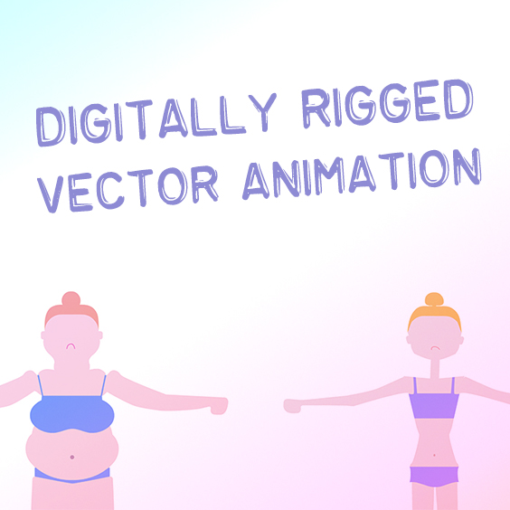
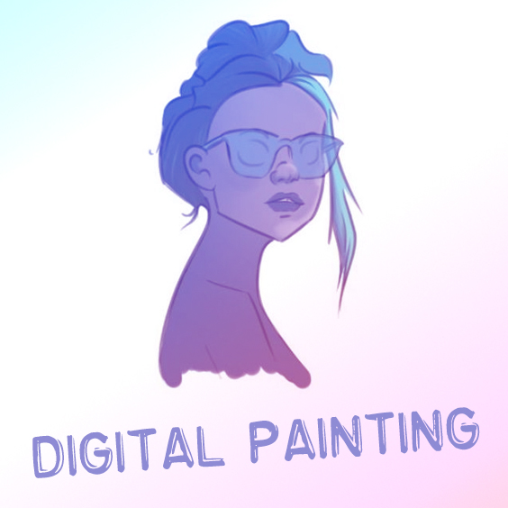
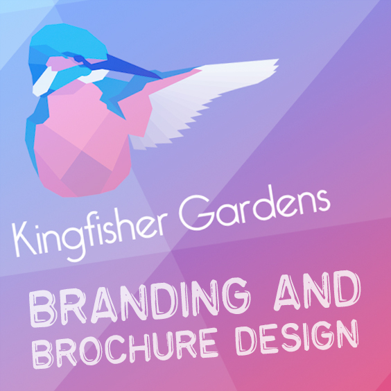
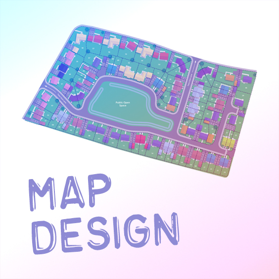
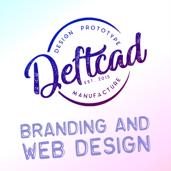
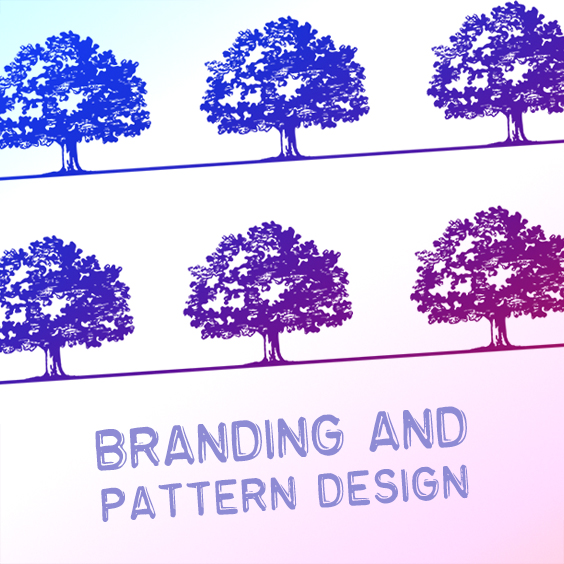
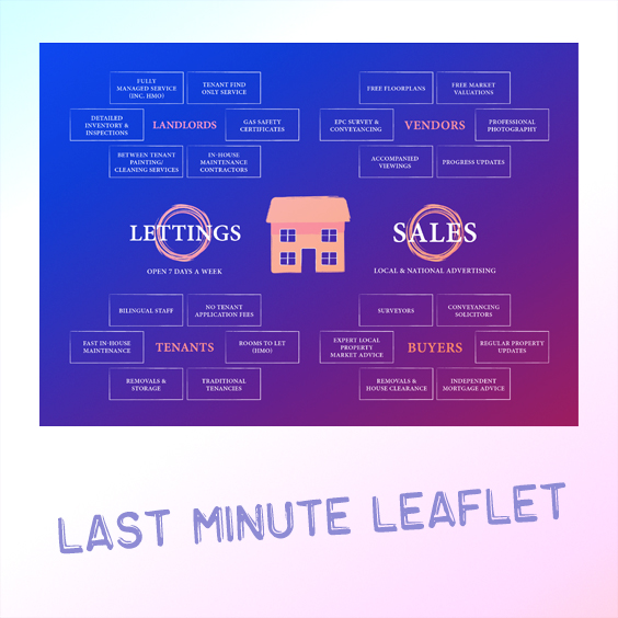
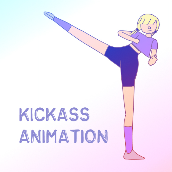
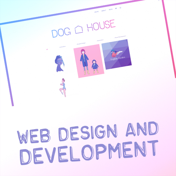
I finally decided to make my homepage a little more uniform by taking a formulaic approach to my featured images. For each portfolio item I made a totally square image with my Cornflower Blue to Froly Pink gradient in the background with a white translucent layer over it. I then took the entire graphic or the most iconic graphical section of the work done, placed it on a white background and used the overlay blend mode, creating an iridescent and colour-controlled graphic. Adding the Emboss Tape font to my branding either in white or my signature Ultraviolet, I added the title or a key phrase summarising the work done within that project.
Voila: a totally uniform way to showcase all of my work within the parameters of my own branding.
This site was developed in conjunction with and is hosted by Drive By Websites & Drive By Design