This project is owned by Drive By Websites & Drive By Design or the respective client, and is posted with permission.
 Ashwood Homes is one of my favourite recurring clients and that's because I find branding one of the best parts of working as a graphic designer. As a housing development company, Ashwood Homes have their own brand complete with guidelines, but their development sites are individually branded to reflect the area's heritage.
Depending on the site's size, these developments are only active for around a year before all of the properties are built and sold, so they are a great opportunity to create a mayfly brand - they aren't designed to be timeless like others, so they can be on-trend and a lot of the usual constraints don't apply.
Keeping the branding on-brand
The Ashwood Homes brand acts as an umbrella under which all of the individually branded development sites fit. To do this, I use the Ashwood Homes brand guidelines document (as created by my predecessor at Drive by Websites and Drive by Design, I believe) as a loose guide and ad-lib the design elements themselves to fit the location and the demographic.
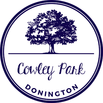
Cowley Park logo design and deconstruction
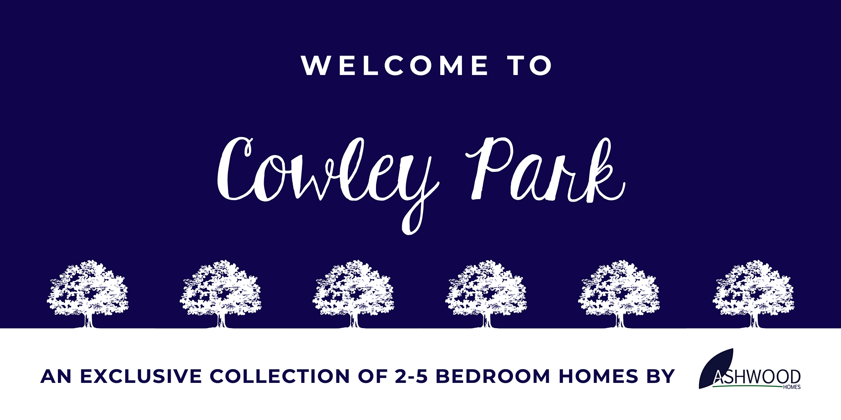
Upon discussion with the team at Ashwood Homes, we settled on a tree graphic to reflect the countryside setting and the 'Park' element in a traditional potato-print style (which was a lot easier to portray in vector format than it appears - thank god for image trace) which was the focal point of the logo. I then deconstructed the logo using the tree graphic and the text across the site's signage (an example of which can be seen at the top) and created a nifty pattern (below) for use across multiple promotional materials, which the client felt was a great wall-papery touch, perfect for a company within their industry.


